6 Dimensionality Reduction
A principal goal of single cell analysis is to distinguish and identify cells by their pattern of gene expression (counts). Cells of the same type or function (like xylem or phloem) should have similar expression patterns. In a mathematical sense, if we constructed a grid in N dimensions (where N is the number of genes) and plotted each cell’s (properly normalized) expression in this space, all xylem cells should end up clustered together in about the same spot, and all phloem cells should cluster together in a different spot.
A practical problem with this simple N-dimensional approach is the sheer number of dimensions. Recall that our dataset has 34218 genes overall and 23848 after eliminating those unexpressed in any cell. It is too difficult to visualize such a space.
Dimensionality reduction is a solution to this problem. We do not expect the cell counts to be uniformly distributed across the entire N-dimensional space, but to lie on lower-dimensional “manifolds” due to the correlation in their expression patterns and the fact that most counts are zero and do not contribute any information. We can use mathematical techniques to “project” the data into a 2-dimensional space that we can more easily visualize. As we will see, this is often sufficient to resolve different kinds of cell.
Besides the counts matrices and row and column metadata, the SingleCellExperiment class has a reducedDim() function to access any dimensionality reduction data we generate. In this chapter, we will explore three commonly used dimensionality reduction techniques, often known by their acronyms PCA, t-SNE, and UMAP.
Our dataset involves cells of known type, but in general your experimental single cell data may not include the cell type. (In fact, there may not be a clear definition of cell type.) In such cases, you may want to classify your cells using statistical clustering methods.
library(SingleCellExperiment)
library(scater)
library(ggplot2)
6.1 Load data and clusters
We begin by reading in our saved data after quality control (if necessary).
# Do not run - depends on workshop timing
# my_SCE_qc <- readRDS("data/my_SCE-04.rds")
We also load the previously determined cluster and supercluster ids corresponding to cell types.
df.clusters <- readRDS("data/clusters_5.rds")
df.clusters$cell_barcode <- substring(df.clusters$cell_barcode, 1, 18)
colData(my_SCE_qc) <- merge(colData(my_SCE_qc), df.clusters, by.x = "Barcode", by.y = "cell_barcode", all.x = TRUE)
head(colData(my_SCE_qc))
## DataFrame with 6 rows and 13 columns
## Barcode Sample sizeFactor sum detected
## <character> <character> <numeric> <numeric> <integer>
## 1 AAACCCACACGCGCAT-1 data/filtered_featur.. 0.764455 2285 1382
## 2 AAACCCACAGAAGTTA-1 data/filtered_featur.. 0.872851 2609 1525
## 3 AAACCCACAGACAAAT-1 data/filtered_featur.. 1.576417 4712 2606
## 4 AAACCCAGTAGCTTTG-1 data/filtered_featur.. 0.415850 1243 998
## 5 AAACCCAGTCCAGTTA-1 data/filtered_featur.. 0.366336 1095 914
## 6 AAACCCAGTTATAGAG-1 data/filtered_featur.. 0.909986 2720 1707
## total low_lib_size low_n_features discard doublet_score
## <numeric> <outlier.filter> <outlier.filter> <logical> <numeric>
## 1 2285 FALSE FALSE FALSE 0.12716
## 2 2609 FALSE FALSE FALSE 0.49708
## 3 4712 FALSE FALSE FALSE 0.46240
## 4 1243 FALSE FALSE FALSE 0.02312
## 5 1095 FALSE FALSE FALSE 0.00000
## 6 2720 FALSE FALSE FALSE 0.16184
## probable_doublet cluster_id supercluster
## <logical> <factor> <factor>
## 1 FALSE 15 Endodermal cells
## 2 FALSE 15 Endodermal cells
## 3 FALSE 4 Atrichoblasts
## 4 FALSE 17 Stele cells
## 5 FALSE 9 Meristematic cells
## 6 FALSE 15 Endodermal cells# Assign display colors for the 21 clusters and 6 superclusters
# (close to those used in Farmer et al.)
cluster_colors <- c(
"cornflowerblue", "darkblue", "cyan",
"springgreen", "olivedrab", "chartreuse", "darkgreen",
"gray", "black", "saddlebrown",
"slateblue", "purple", "pink", "lightpink3", "hotpink", "darkred",
"lightsalmon", "orange", "tan", "firebrick1", "indianred"
)
supercluster_colors <- c("blue", "green", "black", "magenta", "red", "orange")And as one more step in the quality control process, we can remove cells of unknown type. (There are 37 of these.)
unknown_cluster_id <- is.na(my_SCE_qc$cluster_id)
sum(unknown_cluster_id)
## [1] 37my_SCE_qc <- my_SCE_qc[, !unknown_cluster_id]
dim(my_SCE_qc)## [1] 23848 50566.2 Using counts
We will apply these methods first to the raw counts and then to the log-normalized counts, to see firsthand how the latter enhances variation and makes the clusters more distinct.
6.2.1 PCA
The idea behind Principal Component Analysis is that due to correlation (or covariance), the axes in feature (gene) space are generally not the axes with the highest variance. For example, in the simple 2-dimensional example below, the axes of maximum and minimum variance are not along either the x or y axis, but rotated through about 30°. These rotated axes are the principal components of the data. In higher dimensional cases, we find the axis of maximum variance, then the axis of next highest variance at 90° from it, then the axis of next highest variance at 90° from both previous ones, and so on.
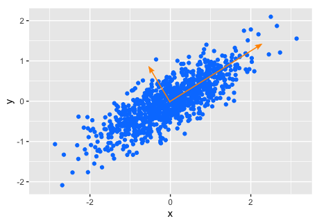
By computing the principal components and retaining only those with the highest variance, we reduce dimensionality at the expense of not accounting for 100% of the variance (like a data compression scheme).
We can use the function runPCA() (from the scater package). The default is to compute the top 50 principal components (generally more than we need), and to consider only the top 500 genes (meaning those with the highest variance).
set.seed(42) # only necessary for sign of PC values, not magnitude
my_SCE_qc <- runPCA(my_SCE_qc, exprs_values = "counts") # ncomponents = 50, ntop = 500 by default
Now we can examine the principal components, and make a scatter plot of the first two.
reducedDims(my_SCE_qc)## List of length 1
## names(1): PCAdim(reducedDim(my_SCE_qc, "PCA"))## [1] 5056 50reducedDim(my_SCE_qc, "PCA")[1:6, 1:4]## PC1 PC2 PC3 PC4
## [1,] -4.053179 11.61384 15.050736 1.305555
## [2,] -19.147165 13.15111 17.176057 1.955806
## [3,] 7.409991 -14.81521 19.296659 31.310012
## [4,] -35.331884 18.12503 8.338565 -7.429924
## [5,] -44.130172 14.22139 7.365172 -5.096884
## [6,] 18.924708 16.63463 11.947987 -6.169856pdf("pdf/pca-counts-sce.pdf")
plotPCA(my_SCE_qc, colour_by = "cluster_id") +
scale_color_manual(values = cluster_colors) +
labs(color = "cluster_id")
dev.off()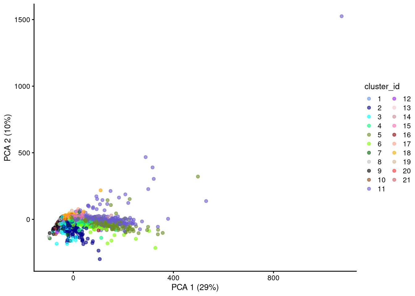
Figure 6.1: PCA plot based on raw counts
PCA is a “linear” method in that it considers variance only along Euclidean straight lines (axes) in the multidimensional space, while the variance might be even higher along a more general curve. We therefore do not expect PCA to distinguish similar cells as well as the nonlinear methods described in the next sections.
6.2.2 t-SNE
t-distributed Stochastic Neighbor Embedding is a nonlinear dimensionality reduction method that stochastically estimates probabilities that pairs of data points are close to each other in the high-dimensional space determined by a previously computed PCA, and uses those probabilities to try to keep them close in the low-dimensional space.
To compute t-SNE, we use the runTSNE() function, which by default still considers the top 500 genes but creates only two columns (2-dimensional output). We use the existing 50 principal components as the high-dimensional space.
set.seed(42)
my_SCE_qc <- runTSNE(my_SCE_qc, exprs_values = "counts", dimred = "PCA")

reducedDims(my_SCE_qc)
## List of length 2
## names(2): PCA TSNEdim(reducedDim(my_SCE_qc, "TSNE"))## [1] 5056 2head(reducedDim(my_SCE_qc, "TSNE"))## TSNE1 TSNE2
## [1,] 10.78910 -21.026402
## [2,] 3.55600 -26.417510
## [3,] 11.00172 12.967392
## [4,] -14.08138 -13.253237
## [5,] -10.47990 2.908543
## [6,] 11.05519 -24.648054pdf("pdf/tsne-counts-sce.pdf")
plotTSNE(my_SCE_qc, colour_by = "cluster_id") +
scale_color_manual(values = cluster_colors) +
labs(color = "cluster_id")
dev.off()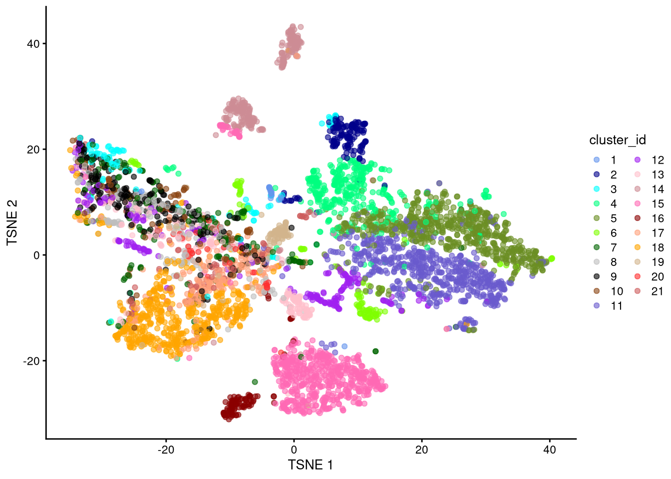
Figure 6.2: t-SNE plot based on raw counts
6.2.3 UMAP
Uniform Manifold Approximation and Projection is another nonlinear method. Like t-SNE, it starts with a high-dimensional space of principal components, and tries to keep nearby data points close in a lower-dimensional space. The main difference is that UMAP represents the points as nodes of a sparse graph, so that topological connections (edges) between neighboring points are what matter instead of absolute distances between points. It therefore compares far less pairs of points than t-SNE, resulting in faster run time.
To compute UMAP, we use the runUMAP() function, which by default (like t-SNE) considers the top 500 genes but creates only two columns (2-dimensional output).
set.seed(42)
my_SCE_qc <- runUMAP(my_SCE_qc, exprs_values = "counts", dimred = "PCA")

reducedDims(my_SCE_qc)
## List of length 3
## names(3): PCA TSNE UMAPdim(reducedDim(my_SCE_qc, "UMAP"))## [1] 5056 2head(reducedDim(my_SCE_qc, "UMAP"))## UMAP1 UMAP2
## [1,] -0.2264755 -5.6009413
## [2,] -0.4828674 -9.1512276
## [3,] -3.3064879 1.4108115
## [4,] 5.5791100 0.3584753
## [5,] 3.5515417 2.6182750
## [6,] -0.4037494 -5.9438730pdf("pdf/umap-counts-sce.pdf")
plotUMAP(my_SCE_qc, colour_by = "cluster_id") +
scale_color_manual(values = cluster_colors) +
labs(color = "cluster_id")
dev.off()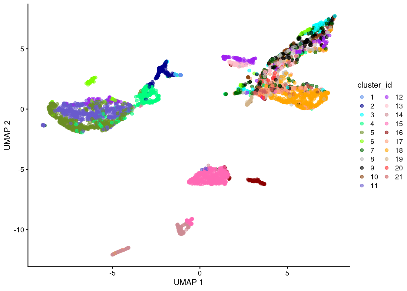
Figure 6.3: UMAP plot based on raw counts
6.3 Using logcounts
Nonlinear dimensionality reduction using raw counts somewhat resolves the cell types, but perhaps we can do better. Let’s try it again using the log-normalized counts.
6.3.1 PCA
set.seed(42)
my_SCE_qc <- runPCA(my_SCE_qc, exprs_values = "logcounts")pdf("pdf/pca-logcounts-sce.pdf")
plotPCA(my_SCE_qc, colour_by = "cluster_id") +
scale_color_manual(values = cluster_colors) +
labs(color = "cluster_id")
dev.off()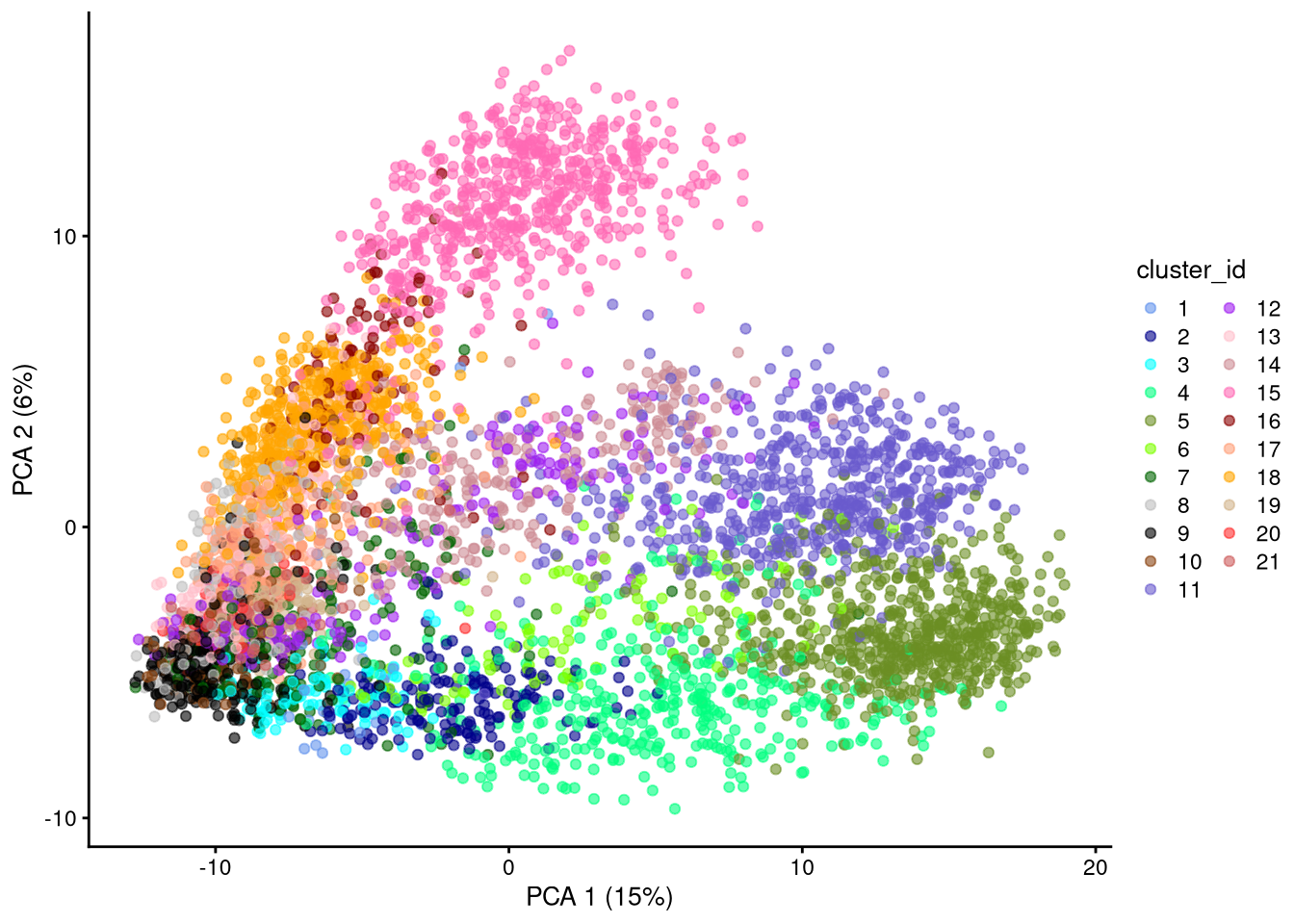
Figure 6.4: PCA plot based on log-normalized counts
Click for answer
set.seed(42)
my_SCE_qc_all_genes <- runPCA(my_SCE_qc, exprs_values = "logcounts", ntop = nrow(my_SCE_qc))pdf("pdf/pca-logcounts-sce-all-genes.pdf")
plotPCA(my_SCE_qc_all_genes, colour_by = "cluster_id") +
scale_color_manual(values = cluster_colors) +
labs(color = "cluster_id")
dev.off()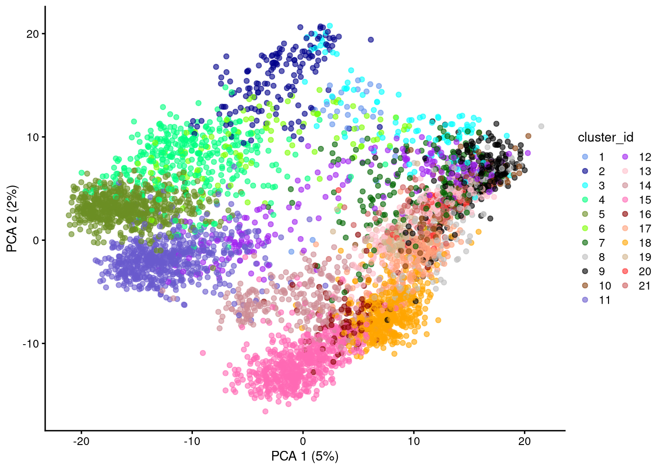
Figure 6.5: PCA plot based on log-normalized counts, using all genes
We may also plot all combinations of the top ncomponents pairs of PCs. The charts on the diagonal show the density of counts v. value of that principal component.
pdf("pdf/pca-logcounts-pairs.pdf")
plotPCA(my_SCE_qc, ncomponents = 4, colour_by = "cluster_id") +
  scale_color_manual(values = cluster_colors) +
  labs(color = "cluster_id")
dev.off()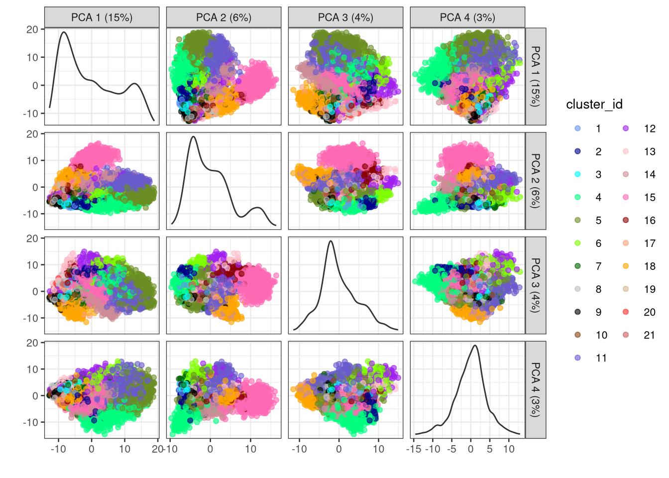
Figure 6.6: PCA plots for all pairs of the first 4 PCs
It is also worth looking at the percentage of variance explained by each principal component.
num_pcs <- ncol(reducedDim(my_SCE_qc, "PCA"))
df_pv <- data.frame(
  pc = 1:num_pcs,
  percent_variance = attr(reducedDim(my_SCE_qc, "PCA"), "percentVar")
)pdf("pdf/pca-percent-variance.pdf")
ggplot(df_pv, aes(x = pc, y = percent_variance)) +
geom_point() +
xlab("Principal Component") +
ylab("Variance explained (%)")
dev.off()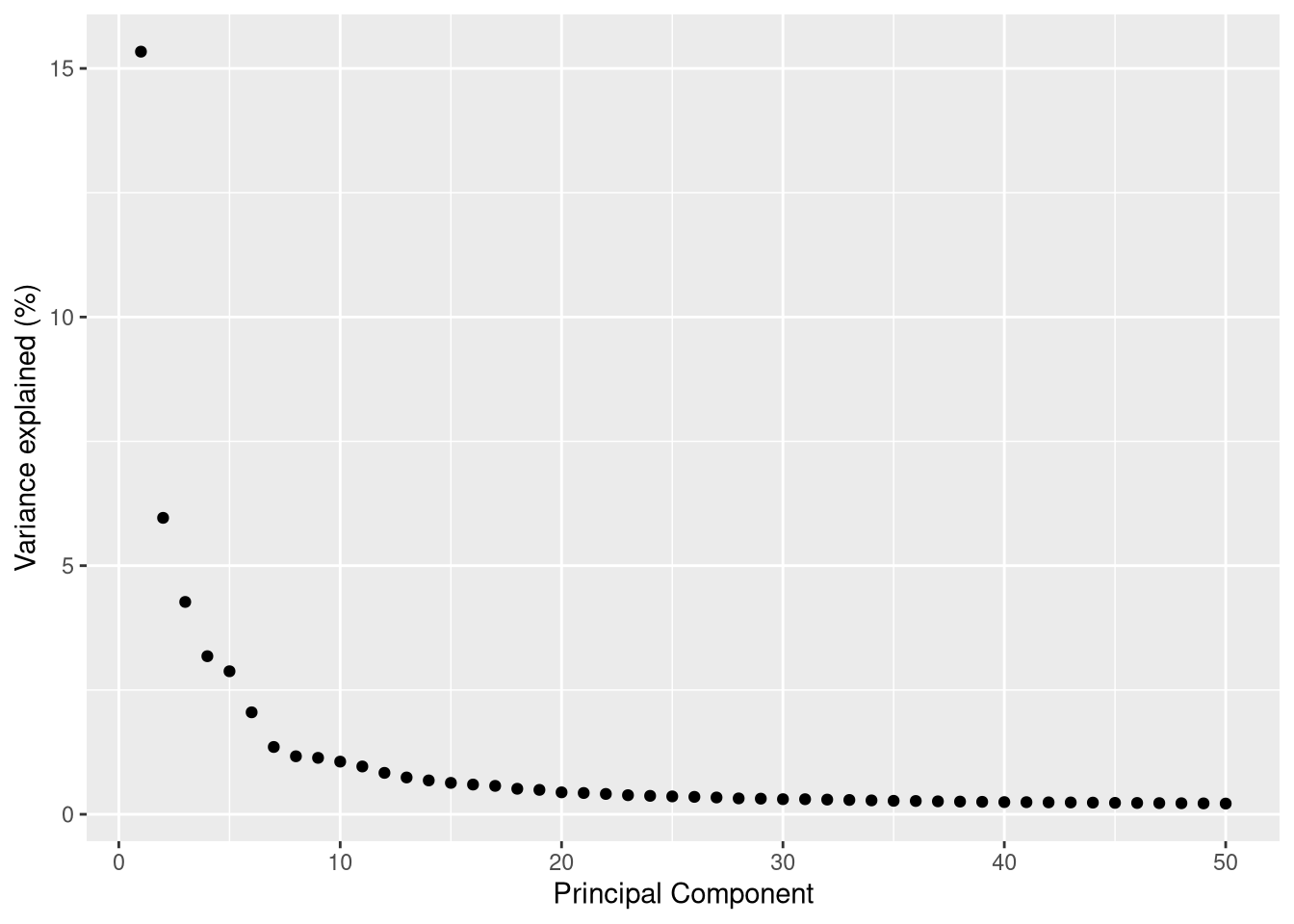
Figure 6.7: Percent variance explained by each PC
This suggests that we can speed up t-SNE and UMAP by using only the first 8-10 principal components (the n_dimred argument below).
6.3.2 t-SNE
t-SNE has a perplexity parameter that usually requires some tuning. In general, a lower perplexity favors local closeness relationships between a small number of data points, and can resolve data that naturally map well to a lower-dimensional space, while a higher perplexity tries to retain longer-range or global relationships between more data points, and is necessary to model fundamentally higher-dimensional data. Some of the links at the end of this chapter discuss the subject in more detail.
We will run t-SNE for three different perplexity values: 10, 30 (the default value), and 100.
set.seed(42)
my_SCE_qc <- runTSNE(my_SCE_qc, exprs_values = "logcounts", dimred = "PCA", n_dimred = 10, perplexity = 10)pdf("pdf/tsne-logcounts-sce-10.pdf")
plotTSNE(my_SCE_qc, colour_by = "cluster_id") +
scale_color_manual(values = cluster_colors) +
labs(color = "cluster_id") +
ggtitle("perplexity = 10")
dev.off()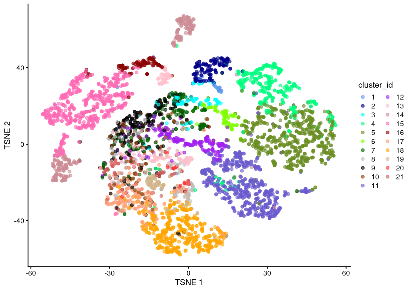
Figure 6.8: t-SNE plot based on log-normalized counts, perplexity = 10
set.seed(42)
my_SCE_qc <- runTSNE(my_SCE_qc, exprs_values = "logcounts", dimred = "PCA", n_dimred = 10) #, perplexity = 30)pdf("pdf/tsne-logcounts-sce-30.pdf")
plotTSNE(my_SCE_qc, colour_by = "cluster_id") +
scale_color_manual(values = cluster_colors) +
labs(color = "cluster_id") +
ggtitle("perplexity = 30")
dev.off()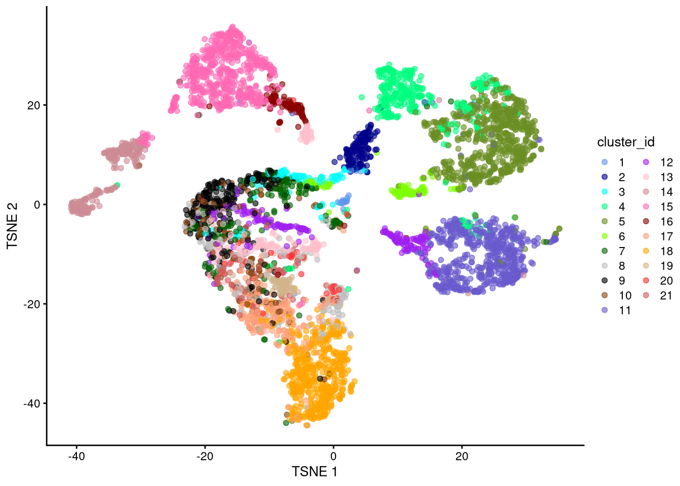
Figure 6.9: t-SNE plot based on log-normalized counts, perplexity = 30
set.seed(42)
my_SCE_qc <- runTSNE(my_SCE_qc, exprs_values = "logcounts", dimred = "PCA", n_dimred = 10, perplexity = 100)pdf("pdf/tsne-logcounts-sce-100.pdf")
plotTSNE(my_SCE_qc, colour_by = "cluster_id") +
scale_color_manual(values = cluster_colors) +
labs(color = "cluster_id") +
ggtitle("perplexity = 100")
dev.off()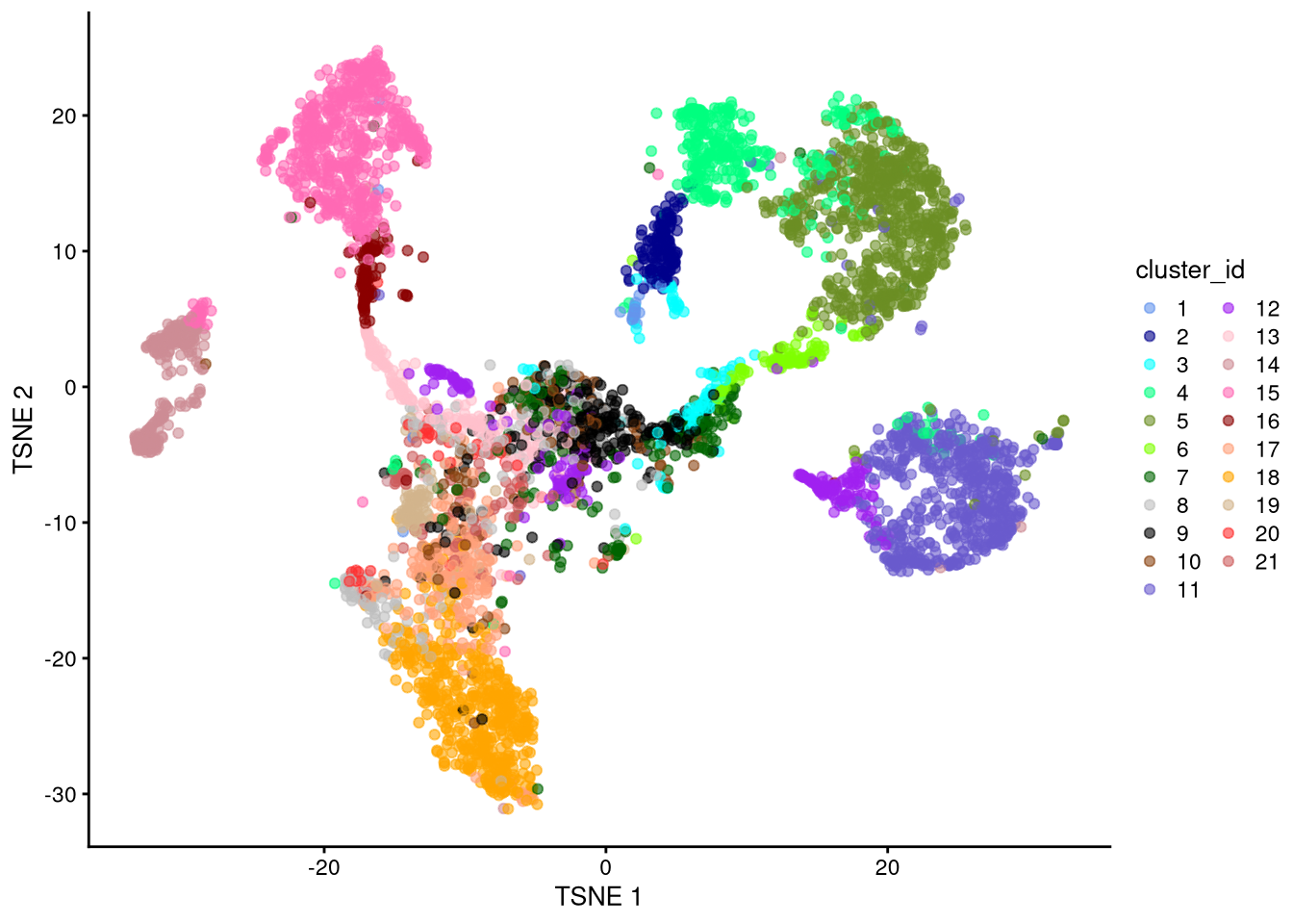
Figure 6.10: t-SNE plot based on log-normalized counts, perplexity = 100
Exercise: Which perplexity value seems most effective? Discuss.
6.3.3 UMAP
We will generate UMAP plots showing both the cluster and supercluster.
set.seed(42)
my_SCE_qc <- runUMAP(my_SCE_qc, exprs_values = "logcounts", dimred = "PCA", n_dimred = 10)
xx <- as.data.frame(reducedDim(my_SCE_qc, "UMAP"))
xx$cluster_id <- as.character(my_SCE_qc$cluster_id)
cc <- unique(xx$cluster_id)
xc <- sapply(cc, function(ci) mean(na.omit(xx[xx$cluster_id == ci, 1])))
yc <- sapply(cc, function(ci) mean(na.omit(xx[xx$cluster_id == ci, 2])))
my_cluster_data <- data.frame(cluster_id = cc, x_centroid = xc, y_centroid = yc, row.names = NULL)pdf("pdf/umap-logcounts-sce-cluster.pdf")
plotUMAP(my_SCE_qc, colour_by = "cluster_id") +
scale_color_manual(values = cluster_colors) +
labs(color = "cluster_id") +
geom_text(data = my_cluster_data, aes(x = x_centroid, y = y_centroid, label = cluster_id))
dev.off()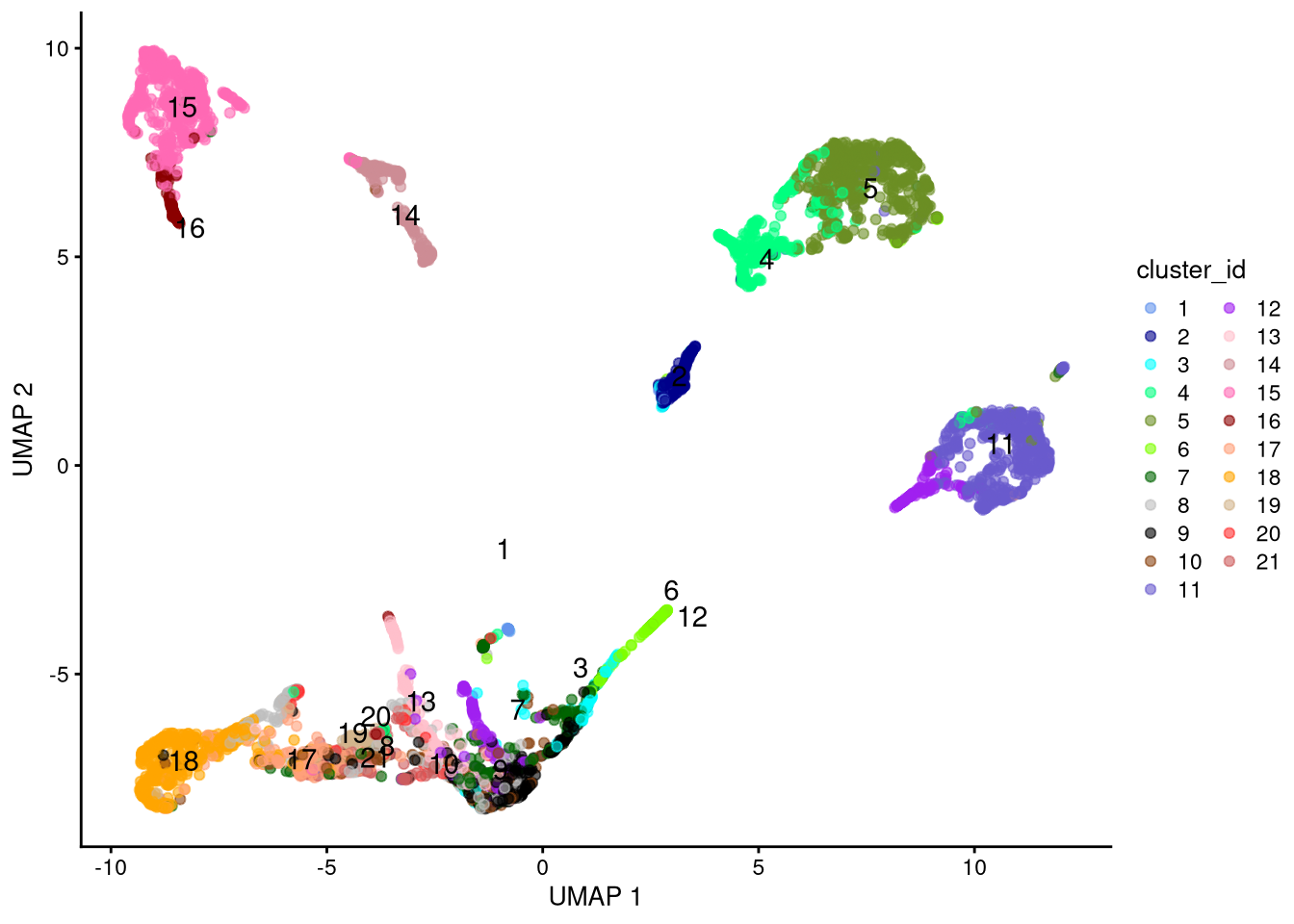
Figure 6.11: UMAP plot based on log-normalized counts, by cluster id
xx$supercluster <- as.character(my_SCE_qc$supercluster)
cc <- unique(xx$supercluster)
xc <- sapply(cc, function(ci) mean(na.omit(xx[xx$supercluster == ci, 1])))
yc <- sapply(cc, function(ci) mean(na.omit(xx[xx$supercluster == ci, 2])))
my_supercluster_data <- data.frame(supercluster = cc, x_centroid = xc, y_centroid = yc, row.names = NULL)pdf("pdf/umap-logcounts-sce-supercluster.pdf")
plotUMAP(my_SCE_qc, colour_by = "supercluster") +
scale_color_manual(values = supercluster_colors) +
labs(color = "supercluster") +
geom_text(data = my_supercluster_data, aes(x = x_centroid, y = y_centroid, label = supercluster))
dev.off()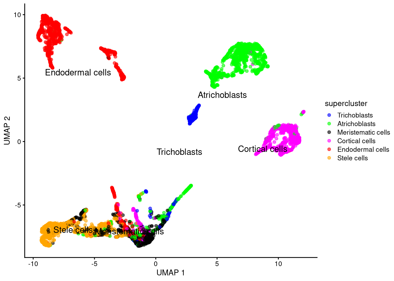
Figure 6.12: UMAP plot based on log-normalized counts, by supercluster
To summarize: due to their nonlinearity, t-SNE and UMAP achieve better dimensionality reduction than PCA. UMAP is typically much faster than t-SNE, though each has a unique visual je ne sais quoi that may appeal to you (or suit your data).
The cell type clusters are now reasonably well resolved. To save the data,
# Do not run - depends on workshop timing
# saveRDS(my_SCE_qc, "data/my_SCE-05.rds")
6.4 Visualizing differential gene expression
6.4.1 Feature plots
Feature plots can identify marker genes associated with a particular cell type. They are basically a dimensionality reduction plot (here, UMAP) colored by gene expression level.
my_genes <- c("AT5G17390", "AT1G68850")pdf("pdf/featureplots-sce.pdf")
plotUMAP(my_SCE_qc, colour_by = my_genes[1]) +
scale_color_gradient(low = "lightgray", high = "blue") +
labs(color = my_genes[1]) +
geom_text(data = my_cluster_data, aes(x = x_centroid, y = y_centroid, label = cluster_id))
plotUMAP(my_SCE_qc, colour_by = my_genes[2]) +
scale_color_gradient(low = "lightgray", high = "blue") +
labs(color = my_genes[2]) +
geom_text(data = my_cluster_data, aes(x = x_centroid, y = y_centroid, label = cluster_id))
dev.off()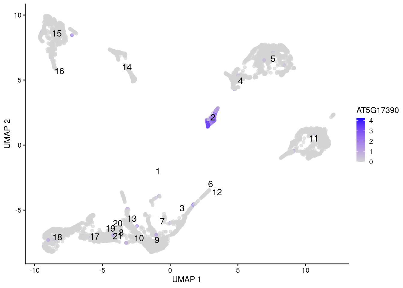
Figure 6.13: Feature plot for marker gene AT5G17390
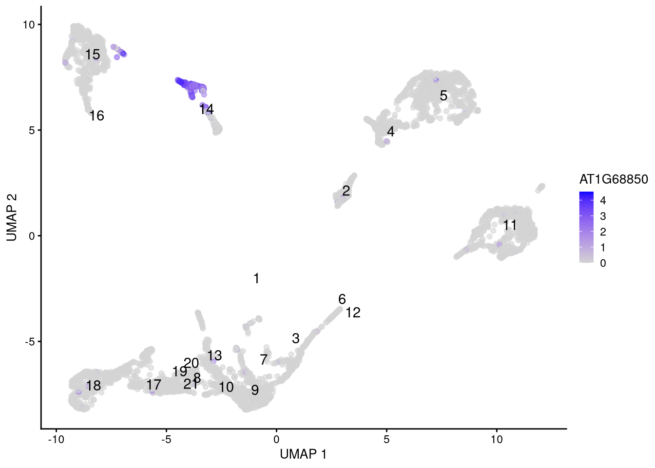
Figure 6.14: Feature plot for marker gene AT1G68850
6.4.2 Dot plots
Dot plots show expression by cluster (or any other category) for several genes simultaneously.
top_6_genes <- head(rowData(my_SCE_qc)$ID[order(-rowData(my_SCE_qc)$detected)])pdf("pdf/dotplot-sce.pdf")
plotDots(my_SCE_qc, features = top_6_genes, group = "supercluster") +
scale_color_gradient(low = "darkblue", high = "red") +
theme(axis.text.x = element_text(angle = 45, hjust = 1))
dev.off()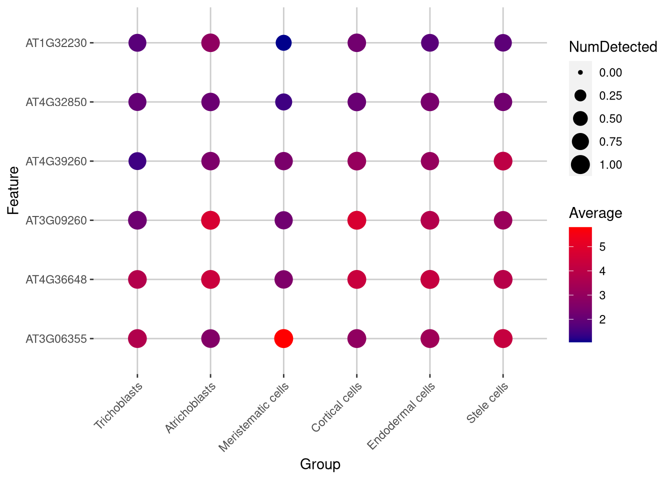
Figure 6.15: Dot plot of expression for selected genes
Click for answer
The bright red dots represent high gene expression. One candidate is gene AT3G06355 which is expressed in meristematic cells.
my_gene <- "AT3G06355"
pdf("pdf/featureplot-exercise.pdf")
plotUMAP(my_SCE_qc, colour_by = my_gene) +
  scale_color_gradient(low = "lightgray", high = "blue") +
  labs(color = my_gene) +
  geom_text(data = my_cluster_data, aes(x = x_centroid, y = y_centroid, label = cluster_id))
dev.off()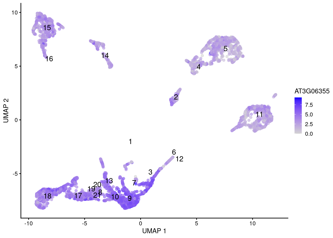
Figure 6.16: Feature plot for selected gene
6.4.3 Finding marker genes
A more direct way to identify marker genes is the findMarkers() function in the Bioconductor scran package, which tests for differential expression between pairs of clusters (or any other groups of cells). Typical usage looks like this,
library(scran)

fm_output <- findMarkers(my_SCE_qc, groups = my_SCE_qc$cluster_id, pval.type = "all")
but there are many optional input arguments, such as which statistical test to use. See ?findMarkers for more details.
The output of findMarkers() is a list of data frames, one for each cluster, with the most likely marker genes on top (sorted by p-value). For example, let’s look at clusters 5 and 11:
fm_output[["5"]]## DataFrame with 23848 rows and 23 columns
## p.value FDR summary.logFC logFC.1 logFC.2
## <numeric> <numeric> <numeric> <numeric> <numeric>
## AT1G29600 1.46637e-29 3.49699e-25 0.553326 0.661236 0.654214
## AT2G01530 1.56544e-19 1.86663e-15 4.156511 4.156511 4.060220
## AT4G37700 7.42060e-19 5.89888e-15 0.256929 0.409608 0.393465
## AT3G16450 1.70569e-17 1.01694e-13 1.034757 2.228578 2.405258
## AT2G39310 5.63020e-17 2.68538e-13 0.680311 2.091140 2.122256
## ... ... ... ... ... ...
## AT4G39753 1 1 0 0 0.00000000
## AT4G39810 1 1 0 0 0.00000000
## AT4G40011 1 1 0 0 -0.06973044
## AT4G09995 1 1 0 0 -0.00242272
## AT4G40100 1 1 0 0 0.00000000
## logFC.3 logFC.4 logFC.6 logFC.7 logFC.8 logFC.9
## <numeric> <numeric> <numeric> <numeric> <numeric> <numeric>
## AT1G29600 0.653711 0.532272 0.553326 0.652382 0.653674 0.652741
## AT2G01530 4.372290 1.622402 3.851312 3.905350 4.237883 4.187862
## AT4G37700 0.394524 0.290280 0.375177 0.384956 0.397373 0.394900
## AT3G16450 2.051358 1.581332 2.083577 1.591288 2.303696 2.266963
## AT2G39310 1.971577 1.550377 1.838470 1.646807 2.046935 2.013589
## ... ... ... ... ... ... ...
## AT4G39753 0.00000000 0.0000000 0 0.00000000 0 -0.0067185
## AT4G39810 0.00000000 0.0000000 0 0.00000000 0 0.0000000
## AT4G40011 0.00000000 -0.0254873 0 -0.00570335 0 0.0000000
## AT4G09995 -0.00766019 0.0000000 0 0.00000000 0 0.0000000
## AT4G40100 -0.00229474 0.0000000 0 0.00000000 0 0.0000000
## logFC.10 logFC.11 logFC.12 logFC.13 logFC.14 logFC.15
## <numeric> <numeric> <numeric> <numeric> <numeric> <numeric>
## AT1G29600 0.661236 0.601069 0.645940 0.646759 0.645554 0.649049
## AT2G01530 3.930759 0.678423 4.093630 4.292246 2.285486 3.332637
## AT4G37700 0.402176 0.256929 0.384377 0.384433 0.357408 0.382538
## AT3G16450 2.219063 0.799455 2.384802 2.325190 1.034757 2.254213
## AT2G39310 1.918676 0.680311 2.037278 1.978987 1.633824 1.880204
## ... ... ... ... ... ... ...
## AT4G39753 0.0000000 0.00000000 0 0 0 0
## AT4G39810 0.0000000 0.00000000 0 0 0 0
## AT4G40011 0.0000000 -0.00182088 0 0 0 0
## AT4G09995 -0.0112457 0.00000000 0 0 0 0
## AT4G40100 0.0000000 0.00000000 0 0 0 0
## logFC.16 logFC.17 logFC.18 logFC.19 logFC.20 logFC.21
## <numeric> <numeric> <numeric> <numeric> <numeric> <numeric>
## AT1G29600 0.661236 0.661236 0.653601 0.647961 0.630392 0.661236
## AT2G01530 4.261391 4.088485 4.184323 4.130560 4.052532 4.179755
## AT4G37700 0.396237 0.385028 0.388642 0.409608 0.409608 0.375984
## AT3G16450 2.321064 2.214980 2.073854 2.293184 2.359249 2.264159
## AT2G39310 1.977650 1.856741 1.952677 1.923786 2.148851 1.962305
## ... ... ... ... ... ... ...
## AT4G39753 0 0 0 0.00000000 0 0
## AT4G39810 0 0 0 -0.00786494 0 0
## AT4G40011 0 0 0 0.00000000 0 0
## AT4G09995 0 0 0 0.00000000 0 0
## AT4G40100 0 0 0 0.00000000 0 0fm_output[["11"]]## DataFrame with 23848 rows and 23 columns
## p.value FDR summary.logFC logFC.1 logFC.2
## <numeric> <numeric> <numeric> <numeric> <numeric>
## AT2G29320 4.10019e-66 9.77814e-62 0.706716 0.814785 0.814785
## AT1G33100 5.78600e-45 6.89922e-41 0.576856 0.620239 0.616030
## AT4G02520 5.11698e-34 4.06766e-30 1.456769 1.549877 1.491759
## AT4G36220 4.20696e-33 2.50819e-29 0.607156 0.877169 0.867450
## AT1G65970 1.16146e-32 5.53968e-29 0.960614 1.023574 0.988466
## ... ... ... ... ... ...
## AT4G39810 1 1 0 0.0000000 0.00000000
## AT4G39970 1 1 0 -0.0486044 -0.00782107
## AT4G40000 1 1 0 0.0000000 -0.00205200
## AT4G09995 1 1 0 0.0000000 -0.00242272
## AT4G40100 1 1 0 0.0000000 0.00000000
## logFC.3 logFC.4 logFC.5 logFC.6 logFC.7
## <numeric> <numeric> <numeric> <numeric> <numeric>
## AT2G29320 0.805682 0.749580 0.802604 0.807358 0.794157
## AT1G33100 0.576856 0.595820 0.556906 0.615335 0.605560
## AT4G02520 1.491743 1.372529 1.137799 1.513146 1.374730
## AT4G36220 0.848900 0.792654 0.641147 0.849696 0.825956
## AT1G65970 0.943911 0.859764 0.871488 0.951628 0.879959
## ... ... ... ... ... ...
## AT4G39810 0.00000000 0.00000000 0.00000000 0.00000000 0.0000000
## AT4G39970 -0.00666817 -0.00498302 -0.00342564 -0.00656736 0.0000000
## AT4G40000 -0.01658711 -0.00426788 -0.00472674 0.00000000 -0.0740316
## AT4G09995 -0.00766019 0.00000000 0.00000000 0.00000000 0.0000000
## AT4G40100 -0.00229474 0.00000000 0.00000000 0.00000000 0.0000000
## logFC.8 logFC.9 logFC.10 logFC.12 logFC.13 logFC.14
## <numeric> <numeric> <numeric> <numeric> <numeric> <numeric>
## AT2G29320 0.802238 0.792142 0.814785 0.798019 0.802114 0.790689
## AT1G33100 0.620239 0.616593 0.620239 0.605495 0.615848 0.613716
## AT4G02520 1.442352 1.481447 1.420171 1.412767 1.477490 1.460566
## AT4G36220 0.833801 0.825726 0.822249 0.607156 0.843948 0.820275
## AT1G65970 0.981111 0.945963 0.953602 0.929005 0.982094 0.909516
## ... ... ... ... ... ... ...
## AT4G39810 0.00000000 0.0000000 0.0000000 0.00000000 0.00000000 0.00000000
## AT4G39970 -0.00502902 -0.0333439 -0.0201636 -0.00557505 -0.00464993 -0.00359363
## AT4G40000 -0.07670058 -0.1526786 -0.1126519 -0.01573582 -0.00942902 -0.01083583
## AT4G09995 0.00000000 0.0000000 -0.0112457 0.00000000 0.00000000 0.00000000
## AT4G40100 0.00000000 0.0000000 0.0000000 0.00000000 0.00000000 0.00000000
## logFC.15 logFC.16 logFC.17 logFC.18 logFC.19 logFC.20
## <numeric> <numeric> <numeric> <numeric> <numeric> <numeric>
## AT2G29320 0.706716 0.801414 0.795451 0.793662 0.797299 0.814785
## AT1G33100 0.614602 0.620239 0.596335 0.604297 0.592688 0.620239
## AT4G02520 1.471526 1.463248 1.315911 1.205941 1.424584 1.456769
## AT4G36220 0.800441 0.858571 0.855136 0.848158 0.832292 0.846869
## AT1G65970 0.977493 0.980967 0.950655 0.958237 0.940065 0.960614
## ... ... ... ... ... ... ...
## AT4G39810 0.00000000 0.0000000 0.0000000 0.0000000 -0.00786494 0
## AT4G39970 0.00000000 0.0000000 -0.0199762 -0.0149293 0.00000000 0
## AT4G40000 -0.00626332 -0.0106804 -0.0182132 -0.0133978 -0.03835635 0
## AT4G09995 0.00000000 0.0000000 0.0000000 0.0000000 0.00000000 0
## AT4G40100 0.00000000 0.0000000 0.0000000 0.0000000 0.00000000 0
## logFC.21
## <numeric>
## AT2G29320 0.801054
## AT1G33100 0.620239
## AT4G02520 1.430733
## AT4G36220 0.854381
## AT1G65970 0.944408
## ... ...
## AT4G39810 0.0000000
## AT4G39970 -0.0263103
## AT4G40000 -0.0576326
## AT4G09995 0.0000000
## AT4G40100 0.0000000We can select likely genes from the top of each table, and visualize their differential expression in feature or dot plots.
fm_genes <- c("AT1G29600", "AT2G29320")

# Confirm that a gene's differential expression is equal and opposite between clusters
fm_output[["5"]][fm_genes[1], "logFC.11"]
## [1] 0.6010694fm_output[["11"]][fm_genes[1], "logFC.5"]## [1] -0.6010694pdf("pdf/featureplots-findmarkers.pdf")
plotUMAP(my_SCE_qc, colour_by = fm_genes[1]) +
scale_color_gradient(low = "lightgray", high = "blue") +
labs(color = fm_genes[1]) +
geom_text(data = my_cluster_data, aes(x = x_centroid, y = y_centroid, label = cluster_id))
plotUMAP(my_SCE_qc, colour_by = fm_genes[2]) +
scale_color_gradient(low = "lightgray", high = "blue") +
labs(color = fm_genes[2]) +
geom_text(data = my_cluster_data, aes(x = x_centroid, y = y_centroid, label = cluster_id))
dev.off()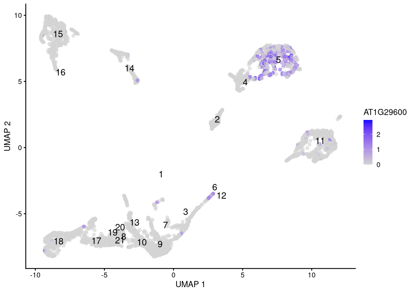
Figure 6.17: Feature plot for marker gene AT1G29600
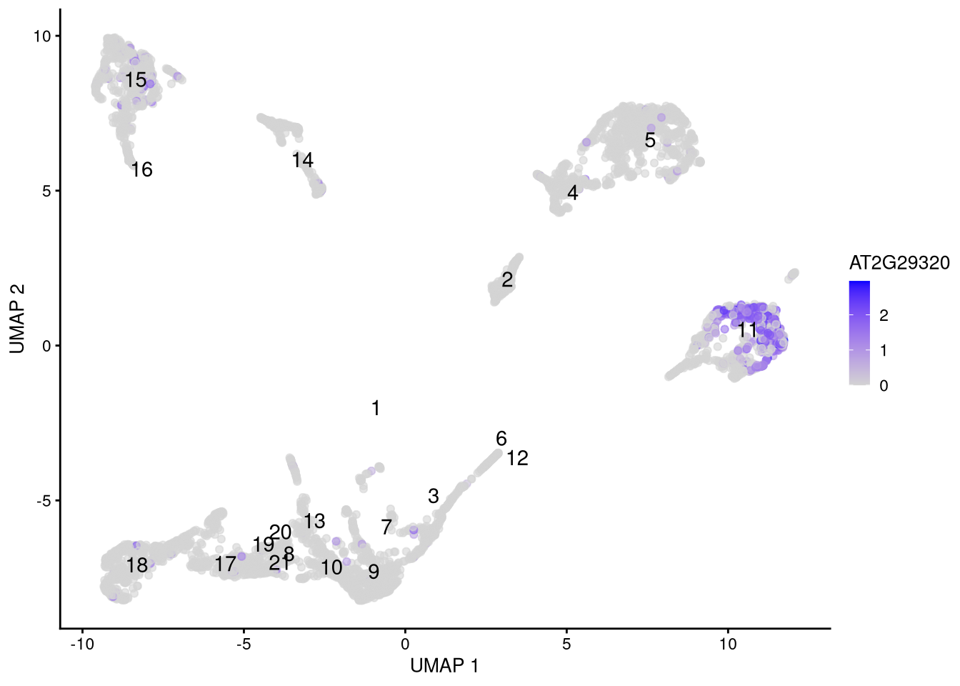
Figure 6.18: Feature plot for marker gene AT2G29320
6.5 Clustering
What if we did not know the cell types? We can assign clusters using standard methods like k-means. For this method, we must provide the centers argument, which is a guess for either the number of clusters (nc = 10 in this example) or an nc × 2 matrix of their centroids.
set.seed(42)
new_clusters <- kmeans(reducedDim(my_SCE_qc, "UMAP"), centers = 10)$cluster
colData(my_SCE_qc)$kmeans_cluster <- as.factor(new_clusters)pdf("pdf/umap-kmeans-clusters-42.pdf")
plotUMAP(my_SCE_qc, colour_by = "kmeans_cluster")
dev.off()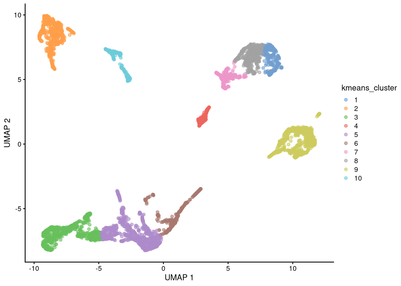
Figure 6.19: UMAP plot with assigned clusters, seed = 42
k-means is a stochastic clustering algorithm and will give different results for different initial random number seeds.
set.seed(43)
new_clusters <- kmeans(reducedDim(my_SCE_qc, "UMAP"), centers = 10)$cluster
colData(my_SCE_qc)$kmeans_cluster <- as.factor(new_clusters)pdf("pdf/umap-kmeans-clusters-43.pdf")
plotUMAP(my_SCE_qc, colour_by = "kmeans_cluster")
dev.off()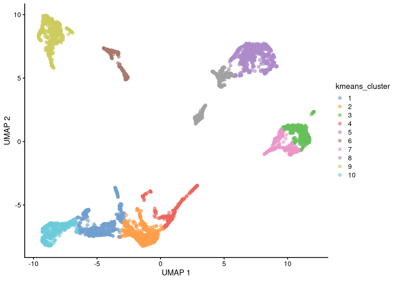
Figure 6.20: UMAP plot with assigned clusters, seed = 43
Exercise: Our choice of 10 clusters was arbitrary. How many would you use? Try it.
6.6 SingleR
While the cell clusters we created above may seem plausible, they tell us nothing about the real cell types to which they correspond (if indeed they do). A better way is to match your cells’ expression patterns against a database of known cell types.
The SingleR Bioconductor package automates this predictive process for you. We start by loading the package,
library(SingleR)As a simple example, we will import one of the other samples from the Farmer et al. paper, and match it against our current dataset. To save time, this has already passed through basic quality control and log-normalization, and contains its known cell types.
another_SCE <- readRDS("data/another_SCE.rds")
dim(another_SCE)
## [1] 20200 1867head(colData(another_SCE))## DataFrame with 6 rows and 8 columns
## Barcode Sample sum detected total
## <character> <character> <numeric> <integer> <numeric>
## 1 AAACCTGAGGTGCACA-1 data-farmer-et-al/sN.. 1503 1153 1503
## 2 AAACCTGGTATAATGG-1 data-farmer-et-al/sN.. 947 533 947
## 3 AAACCTGGTTCGGCAC-1 data-farmer-et-al/sN.. 651 570 651
## 4 AAACCTGTCACTTATC-1 data-farmer-et-al/sN.. 547 397 547
## 5 AAACCTGTCCTTTCTC-1 data-farmer-et-al/sN.. 2173 1041 2173
## 6 AAACCTGTCTTTCCTC-1 data-farmer-et-al/sN.. 846 676 846
## sizeFactor cluster_id supercluster
## <numeric> <factor> <factor>
## 1 1.285180 5 Atrichoblasts
## 2 0.809757 11 Cortical cells
## 3 0.556655 3 Trichoblasts
## 4 0.467727 4 Atrichoblasts
## 5 1.858081 11 Cortical cells
## 6 0.723395 5 AtrichoblastsWe predict the cell types using the function SingleR() (this takes a few minutes), then inspect the results. Note that the default de.method = "classic" is meant to be used with bulk data; for single cell data you should use "wilcox" or "t" instead, and either increase the number of genes it considers (de.n) or explicitly pass it a list of known marker genes. See the SingleR package documentation for more details.
predicted_clusters <- SingleR(test = another_SCE, ref = my_SCE_qc, labels = my_SCE_qc$cluster_id, de.method = "wilcox", de.n = 100)
predicted_clusters
## DataFrame with 1867 rows and 4 columns
## scores labels delta.next pruned.labels
## <matrix> <character> <numeric> <character>
## 1 0.142541:0.0881322:0.299658:... 5 0.0455832 5
## 2 0.147456:0.0635414:0.231816:... 11 0.0655302 11
## 3 0.134905:0.0787721:0.148035:... 3 0.1055122 3
## 4 0.157547:0.0412959:0.113228:... 1 0.1061591 1
## 5 0.181679:0.0736958:0.273199:... 11 0.1149848 11
## ... ... ... ... ...
## 1863 0.241621:0.0427911:0.104704:... 1 0.2469319 1
## 1864 0.128798:0.0644179:0.234364:... 11 0.0630174 11
## 1865 0.133039:0.0535972:0.255581:... 11 0.0675449 11
## 1866 0.225669:0.0603004:0.186853:... 1 0.1574142 1
## 1867 0.154530:0.0775893:0.263055:... 11 0.0134828 11The scores column is a matrix of prediction quality scores for each cell type, and delta.next is the difference between the best and second best score. The labels and pruned.labels columns indicate the predicted cell type before and after pruning; the latter may be NA (unknown) if the prediction is especially uncertain.
sum(is.na(predicted_clusters$pruned.labels))## [1] 2In our example, this was true for two cells.
We now assign the predicted clusters to another_SCE.
# convert the predicted cluster id to a factor
another_SCE$pred_cluster_id <- as.factor(predicted_clusters$labels)
# put the factor levels in the correct order
another_SCE$pred_cluster_id <- factor(another_SCE$pred_cluster_id, levels = levels(my_SCE_qc$cluster_id))
head(colData(another_SCE))
## DataFrame with 6 rows and 9 columns
## Barcode Sample sum detected total
## <character> <character> <numeric> <integer> <numeric>
## 1 AAACCTGAGGTGCACA-1 data-farmer-et-al/sN.. 1503 1153 1503
## 2 AAACCTGGTATAATGG-1 data-farmer-et-al/sN.. 947 533 947
## 3 AAACCTGGTTCGGCAC-1 data-farmer-et-al/sN.. 651 570 651
## 4 AAACCTGTCACTTATC-1 data-farmer-et-al/sN.. 547 397 547
## 5 AAACCTGTCCTTTCTC-1 data-farmer-et-al/sN.. 2173 1041 2173
## 6 AAACCTGTCTTTCCTC-1 data-farmer-et-al/sN.. 846 676 846
## sizeFactor cluster_id supercluster pred_cluster_id
## <numeric> <factor> <factor> <factor>
## 1 1.285180 5 Atrichoblasts 5
## 2 0.809757 11 Cortical cells 11
## 3 0.556655 3 Trichoblasts 3
## 4 0.467727 4 Atrichoblasts 1
## 5 1.858081 11 Cortical cells 11
## 6 0.723395 5 Atrichoblasts 5Finally, we compute its overall accuracy and plot its confusion matrix.
tbl <- table(another_SCE$cluster_id, another_SCE$pred_cluster_id, dnn = c("Real", "Pred"))
accuracy <- sum(diag(tbl))/sum(tbl)
print(paste("Accuracy =", round(100*accuracy, 1), "%"))
## [1] "Accuracy = 73.5 %"# Convert tbl from counts to probabilities
tbl <- tbl/rowSums(tbl) # Real is in rows, Pred in columns
conf_mx <- as.data.frame(tbl)pdf("pdf/predicted-clusters-confusion-matrix.pdf")
ggplot(conf_mx, aes(x = Pred, y = Real)) +
geom_tile(aes(fill = Freq)) +
coord_fixed() +
scale_fill_gradient(low = "white", high = "darkblue")
dev.off()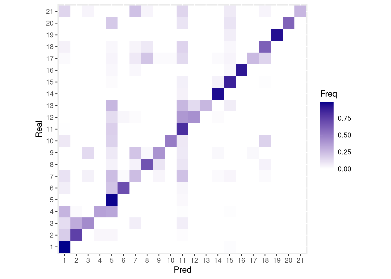
Figure 6.21: Confusion matrix for cluster_id
SingleR includes functions for assessing the uncertainty of the predicted cell types. For example, plotScoreHeatmap() creates a heatmap from the values in the scores matrix.
pdf("pdf/predicted-clusters-score-heatmap.pdf")
plotScoreHeatmap(predicted_clusters)
dev.off()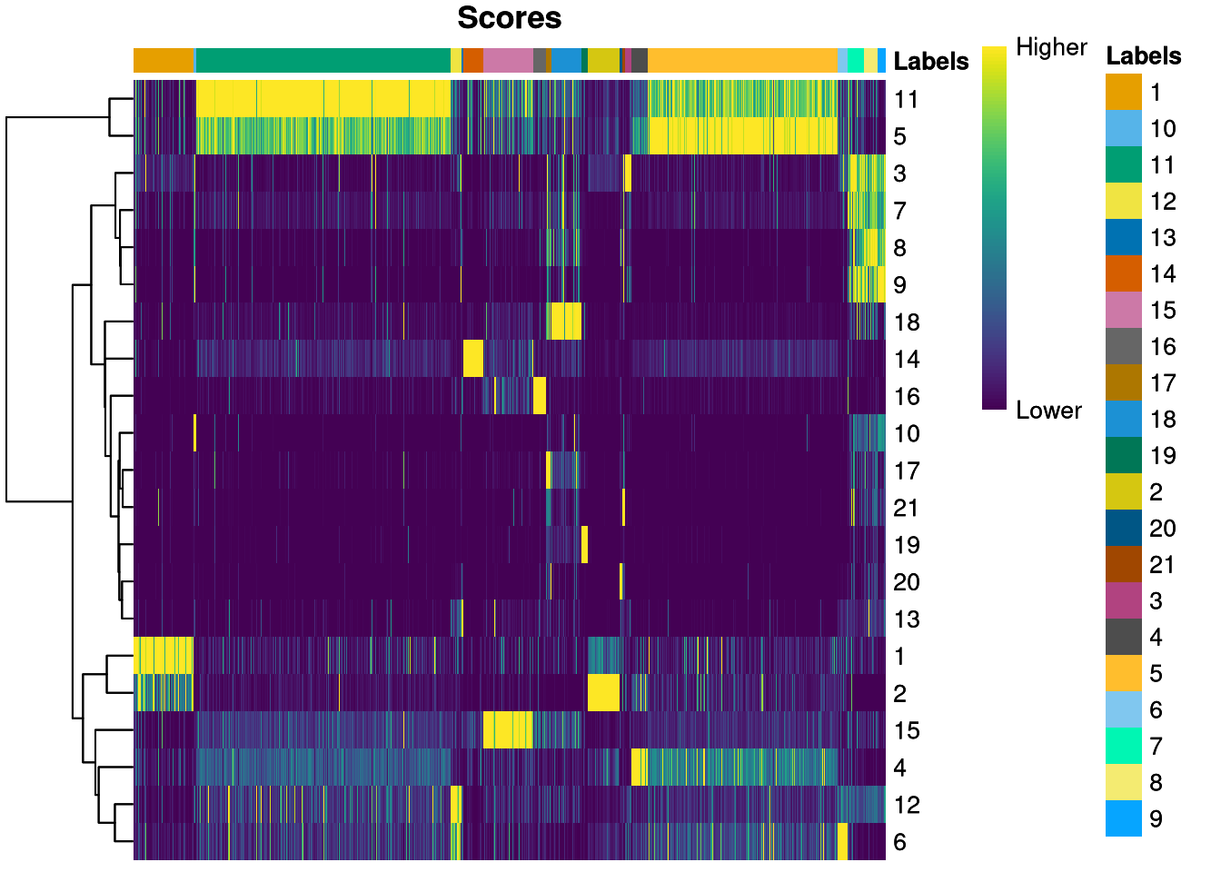
Figure 6.22: Score heatmap for predicted cluster_id
Its rows represent cell types (cluster_id), its columns represent cells, and the bar across the top organizes the cells by predicted type. For example, many cells of types 5 and 11 receive nearly ambiguous predictions, as do cell types 1 and 2. These cell types probably have similar patterns of gene expression (possibly indicating similar function or even structure), making them difficult to distinguish.
another_SCE superclusters as well. Assign them to a pred_supercluster column and create a confusion matrix v. the real superclusters.
Click for answer
predicted_superclusters <- SingleR(test = another_SCE, ref = my_SCE_qc, labels = my_SCE_qc$supercluster, de.method = "wilcox", de.n = 100)

another_SCE$pred_supercluster <- as.factor(predicted_superclusters$labels)
another_SCE$pred_supercluster <- factor(another_SCE$pred_supercluster, levels = levels(my_SCE_qc$supercluster))

tbl <- table(another_SCE$supercluster, another_SCE$pred_supercluster, dnn = c("Real", "Pred"))
accuracy <- sum(diag(tbl))/sum(tbl)
print(paste("Accuracy =", round(100*accuracy, 1), "%"))
## [1] "Accuracy = 80.6 %"tbl <- tbl/rowSums(tbl)
conf_mx <- as.data.frame(tbl)pdf("pdf/predicted-superclusters-confusion-matrix.pdf")
ggplot(conf_mx, aes(x = Pred, y = Real)) +
geom_tile(aes(fill = Freq)) +
coord_fixed() +
scale_fill_gradient(low = "white", high = "darkred")
dev.off()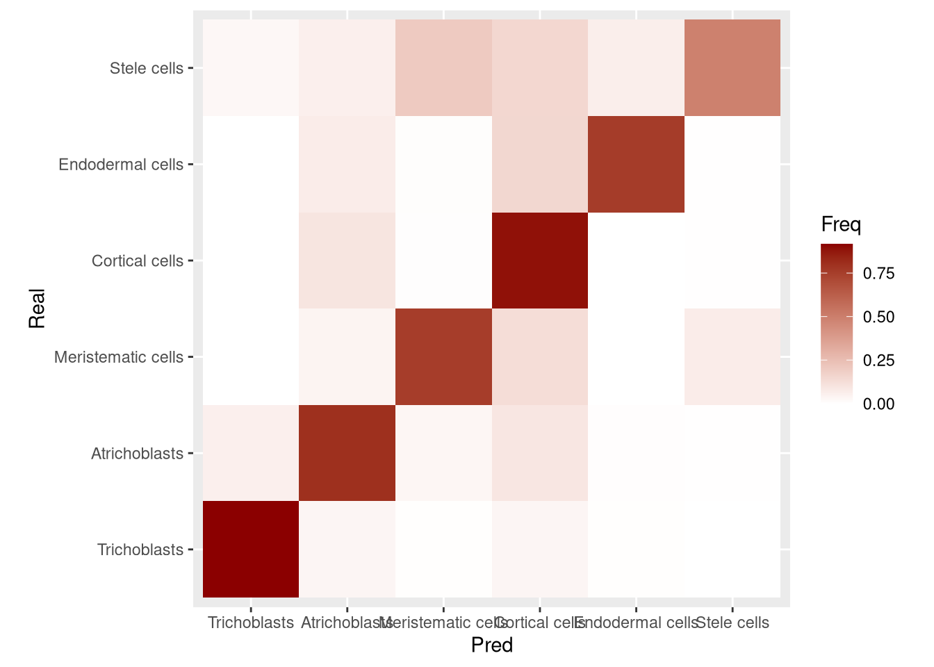
Figure 6.23: Confusion matrix for supercluster
Here we used our own dataset as the reference. If you work with human or mouse single-cell data, the Bioconductor packages celldex and scRNAseq provide several public cell type databases for annotating them.
6.7 Further resources
Coenen and Pearce, Understanding UMAP.
Czarnewski, Dimensionality reduction video, ELIXIR EXCELERATE course Single cell RNA-seq data analysis with R (2019).
Lun, Assigning Cell Types with SingleR (2020).
McInnes, Healy, and Melville, UMAP: Uniform Manifold Approximation and Projection for Dimension Reduction (2020).
Tran, Comparing UMAP vs t-SNE in Single-cell RNA-Seq Data Visualization, Simply Explained
van der Maaten and Hinton, Visualizing Data using t-SNE, J. Machine Learning Research 1, 1-48 (2008).
Wattenberg, Viégas, and Johnson, How to Use t-SNE Effectively, Distill (2016).
Wikipedia: Principal Component Analysis • t-SNE • UMAP